Hoss-KickBrand Guide
Everything you need to represent Hoss-Kick consistently. Compliance-first care execution infrastructure.
80+
EMR Integrations
6 Major Health Systems
Trusted By
HIPAA Certified
Compliance
What is Hoss-Kick?
Compliance-first care execution infrastructure that integrates with existing EMRs to support structured care programs and ensure documentation integrity.
Compliance-First
Audit-ready by design. Every workflow, every document meets regulatory requirements.
EMR Integrated
Works alongside your existing systems. Epic, Cerner, Athena, and 80+ others.
Documentation
Complete and traceable. Evidence of care is available when needed.
Official Descriptions
Hoss-Kick provides care execution infrastructure that integrates with existing EMRs to support structured care programs. Documentation is complete and traceable, and evidence of care is available when needed. RPM, CCM, and other regulated programs are supported as structured workflows.
Care Execution Infrastructure
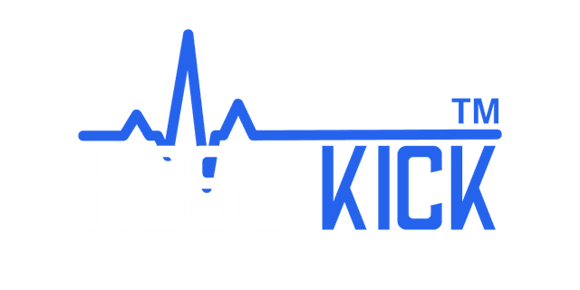
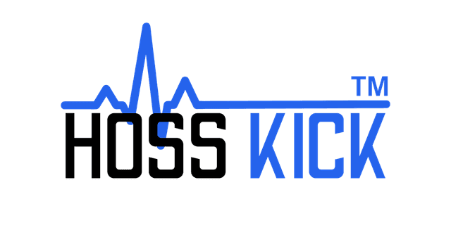
Logo System
Our logo is the primary visual identifier. Use it consistently across all touchpoints.
Clear Space
Maintain minimum clear space equal to the height of the "H" on all sides.
Minimum Size
Digital: 120px width minimum. Print: 1 inch minimum.
Color Palette
Our colors balance healthcare professionalism with modern technology.
Primary
Neutrals
Type System
Our typography system ensures clarity, hierarchy, and consistency across all brand communications.
Font Families
Inter
Our primary typeface for all communications. Clean, modern, and highly legible across all sizes.
Aa Bb Cc 123
Available Weights
Usage
Headlines, body text, UI elements
font-family: 'Inter', -apple-system, BlinkMacSystemFont, sans-serif;JetBrains Mono
Used for code snippets, technical content, and data displays.
Aa Bb Cc 123
Available Weights
Usage
Code blocks, API references, technical documentation
font-family: 'JetBrains Mono', 'Fira Code', monospace;Primary Font Preview — Inter
Aa Bb Cc Dd Ee
The quick brown fox jumps over the lazy dog
ABCDEFGHIJKLMNOPQRSTUVWXYZ
abcdefghijklmnopqrstuvwxyz
0123456789 !@#$%^&*()_+-=
Font Weights
Aa
Regular
400
Body text, paragraphs
Aa
Medium
500
Labels, captions
Aa
Semibold
600
Subheadings, buttons
Aa
Bold
700
Headlines, emphasis
Type Scale
Implementation
Google Fonts (Recommended)
Add this to your HTML <head> section:
<link rel="preconnect"
  href="https://fonts.googleapis.com">
<link rel="preconnect"
  href="https://fonts.gstatic.com"
  crossorigin>
<link href="https://fonts.googleapis.com/
  css2?family=Inter:wght@400;500;600;700
  &display=swap" rel="stylesheet">
CSS @import
Add this to your CSS file:
@import url('https://fonts.googleapis.com/
  css2?family=Inter:wght@400;500;600;700
  &display=swap');

body {
  font-family: 'Inter',
    -apple-system,
    BlinkMacSystemFont,
    sans-serif;
}
Typography Guidelines
Hierarchy
Maintain clear visual hierarchy. Use size and weight to establish importance. Never skip heading levels.
Readability
Body text should be 16px minimum. Line length should be 60-80 characters for optimal reading.
Consistency
Use the defined type scale consistently. Avoid arbitrary sizes. Stick to the established weights.
How We Communicate
Our voice is confident, clear, supportive, and professional.
Confident
We speak with authority on compliance and care execution.
Clear
No jargon. Straightforward healthcare language.
Supportive
We enhance clinical workflows, not replace them.
Professional
Healthcare-grade communication, always.
Do Say
- ✓ "Integrates with your existing EMR"
- ✓ "Audit-ready documentation by design"
- ✓ "Works alongside clinician oversight"
- ✓ "Structured workflows for regulated programs"
Don't Say
- ✕ "Replaces your clinical staff"
- ✕ "AI makes clinical decisions"
- ✕ "Guaranteed compliance"
- ✕ "Disrupts your current workflow"
Brand Applications
How to apply the brand across different touchpoints.
Website
Blue (#4361EE) for CTAs, black for headings, slate for body.
Email Signatures
Logo at 120px, name bold, title in slate gray.
Presentations
White slides, blue accents, logo on title slides.
Social Media
Logo as profile, brand blue as accent color.
Print Materials
CMYK values, 300 DPI minimum, adequate margins.
Trade Shows
Large logo display, blue accent, clean design.
Brand Assets
Download official logo files and brand assets.